

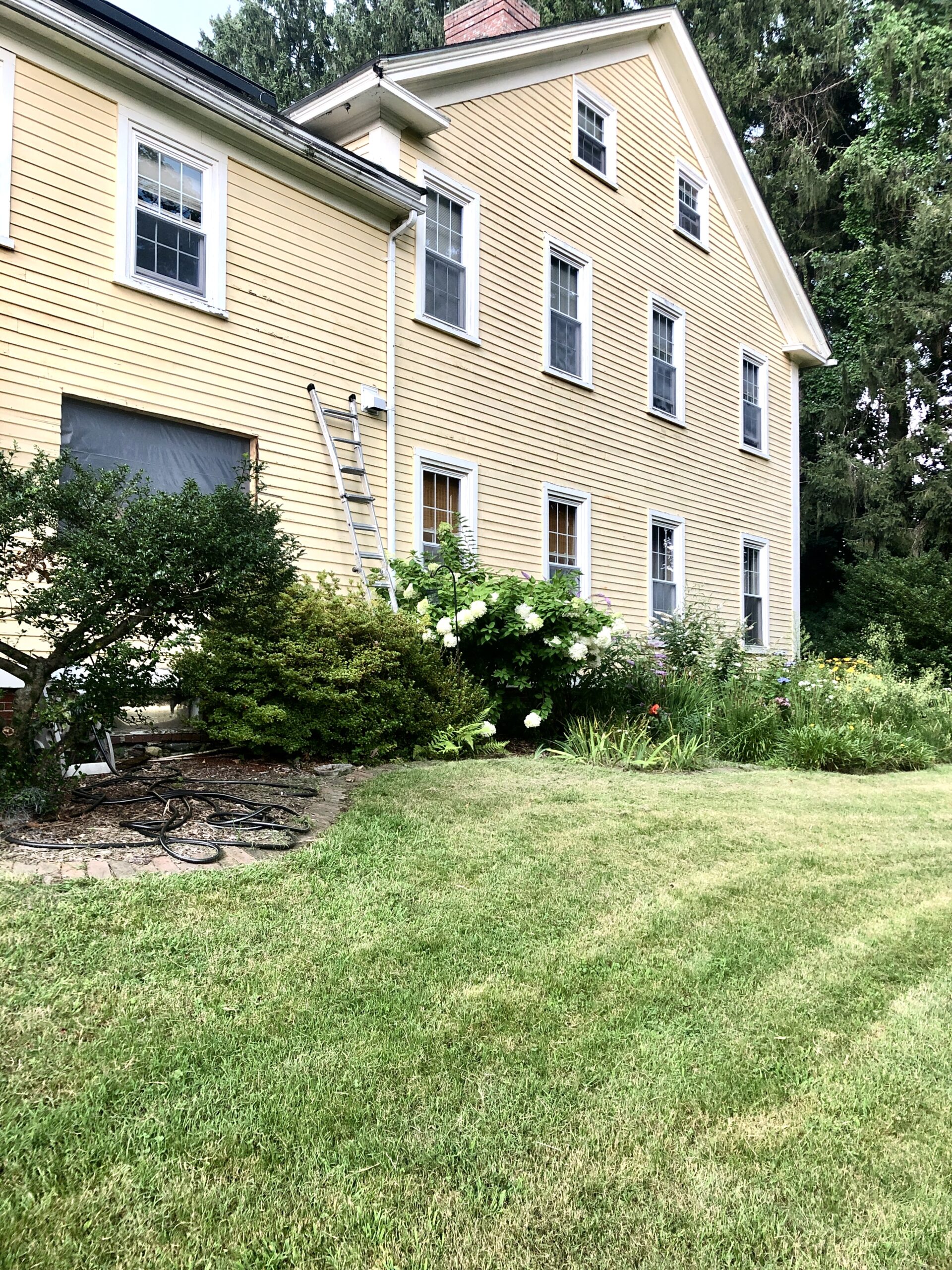
The sun is shining in this brilliant way most mornings lately, as we head to daily Mass, unless it's actually raining, which it has been, a lot. So when it does shine, I have to snap a pic!
Book Corner
I'm going to update my Spiritual Reading post to include the Newman Sermons I've mentioned here, as well as this book, The Friendship of Christ, by Robert Hugh Benson. (affiliate link)

Benson has always been on my favorites list, but recently I've made a connection with St. John Henry Newman, in that way each has of delving into an aspect of the spiritual life and taking the reader to the point of utter abandonment to God (where, like it or not, we will ultimately go).
Both of these authors keep confronting us with our self-love, so often disguised by a genuine, if misguided, desire to be better, to live up to God's promise; they wish to help us confront and reject, rather than pursue, the desire to be “dynamic” and “the best version of ourselves.”
I would say that most if not all spiritual guidance today falls into this motivational trap of dynamism, purporting to offer Christianity as a more effective way to reach the goal of self-actualization, rather than the purgative way necessary to be trod before we can be, simply, friends of Christ. We desperately want intimate companionship with Him, but it's so easy to be misled by people who don't understand what this means, as Leila Miller says here, because they are not rooted in the wisdom of the Church through the ages.
I was struck, as I'm re-reading The Friendship of Christ, how often Benson uses the word shame — a word not in the vocabulary of today's spiritual writings.
Where current spiritual trends keep us hungering for signs of God's nearness, Benson warns us of the inevitable resentment that occurs when we seek such things for their own sake and are inevitably disappointed (since Christ will withdraw) in His desire for us to seek Him alone.
One passage struck me the other day, out of many deep and spiritually nourishing observations: Benson says, “… how, without such withdrawals, is progress possible? How is our hold upon our friend to be tightened unless now and again it seems as if he were slipping from our grasp? How is real faith to throw out its roots and clench its fibres into the rock, unless the desolating wind of trouble at times threatens to uproot us altogether?… To hold our lips to that cup which our savior drained… should surely be enough to make us hold our peace, for very shame.”

Kitchen Progress Corner
Was excited to come home after a day away to find this vent for the gas stove had been installed (and the stove is on the way yay! not that there is a floor to put it on, waahh):
The ceiling is done!

And the wainscoting with bead board as well.
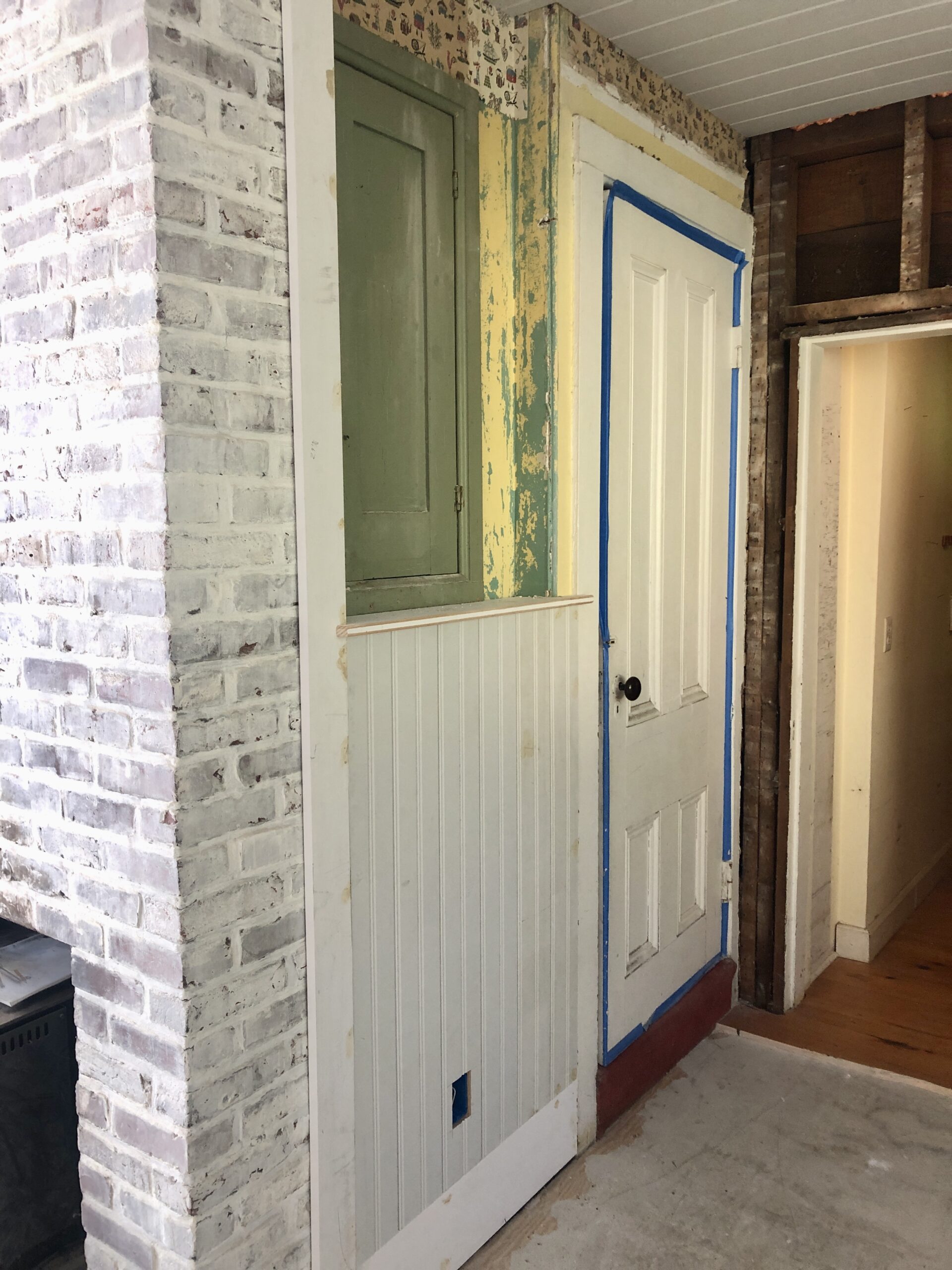
Next up: plastering! And then painting! And a floor and windows… <silent sob>
This is my inspiration photo for color (I posted about this Swedish decorating book recently but don't remember where, and also here).
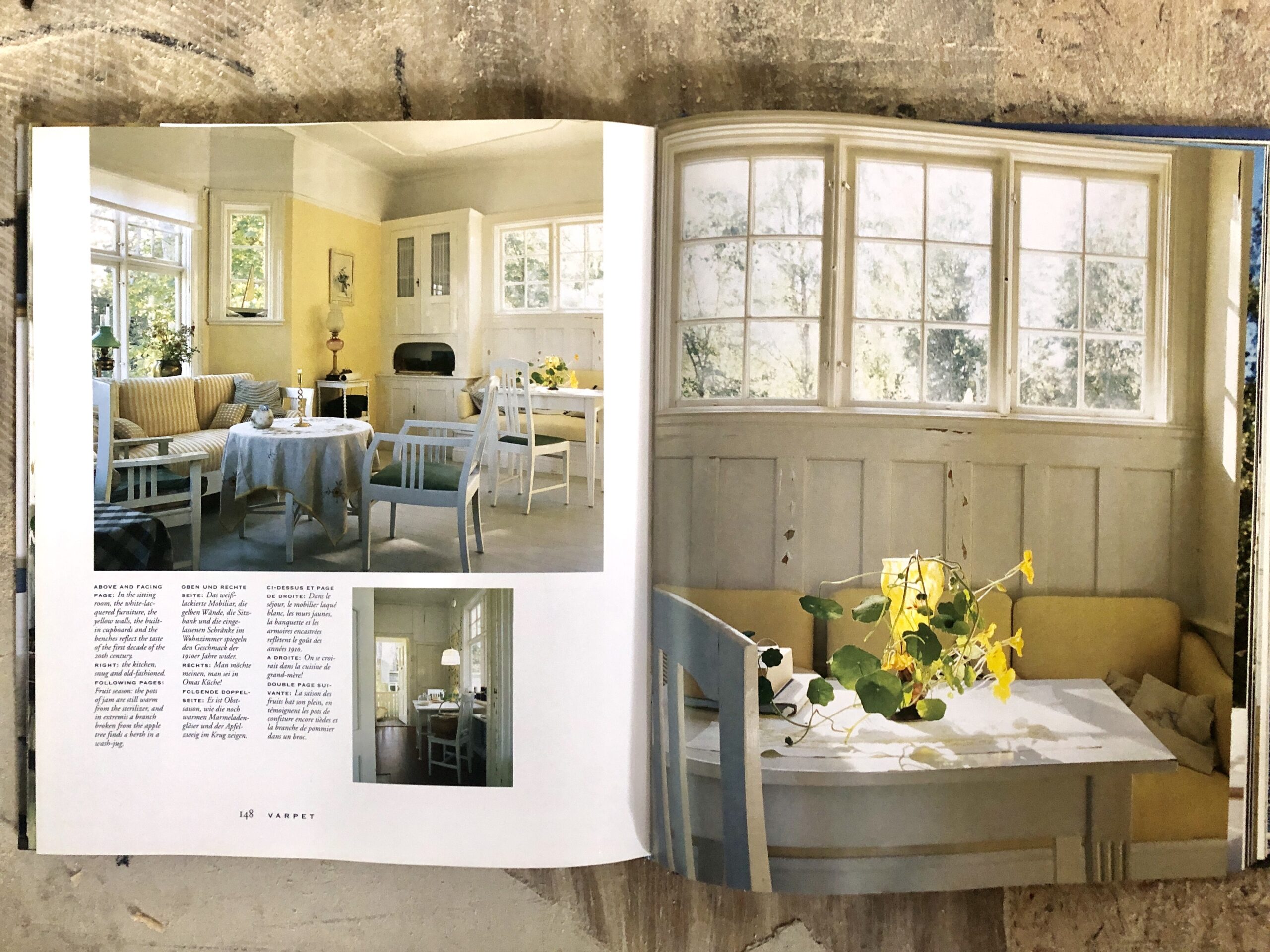
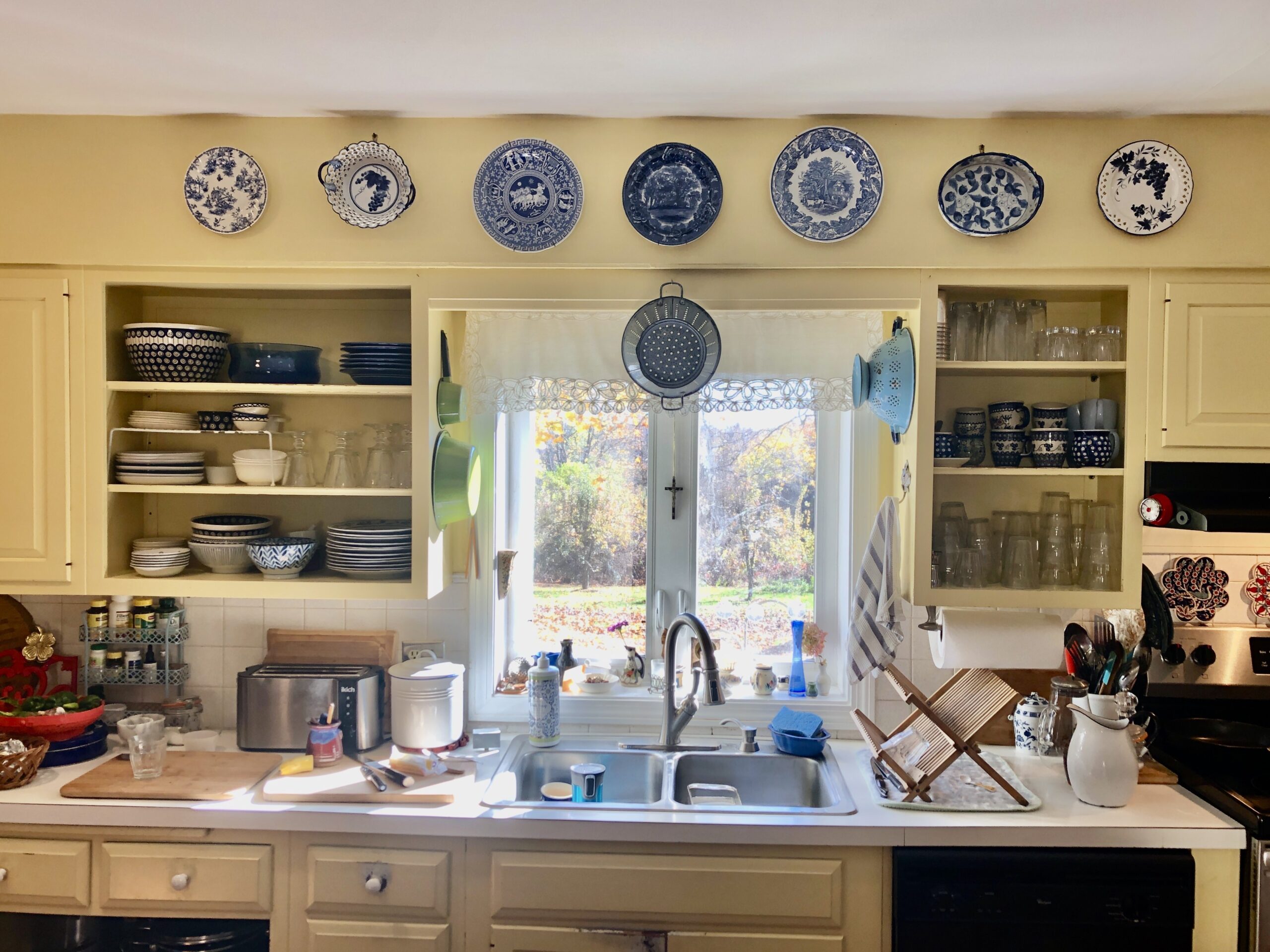
It's not a kitchen, but it does have cabinets and walls the way a kitchen does. I have found few if any images of kitchens where the cabinets are the “trim” color and the wall is the “main” color. Usually in a yellow kitchen, the cabinets are yellow and the walls are white.
But I'm nervous about committing to such a strong color for cabinets. I always have to keep in mind that we probably will downsize in a few years (currently the renovation fits into our “five-year plan”). Will buyers want yellow cabinets? Will I??
I did love the color on the ones we had. They were Hawthorne Yellow (Benjamin Moore) — third from the right, below. Right now the trend is to a much more brown, mustardy yellow, but I do love the brightness. The black is there to represent the soapstone counters.
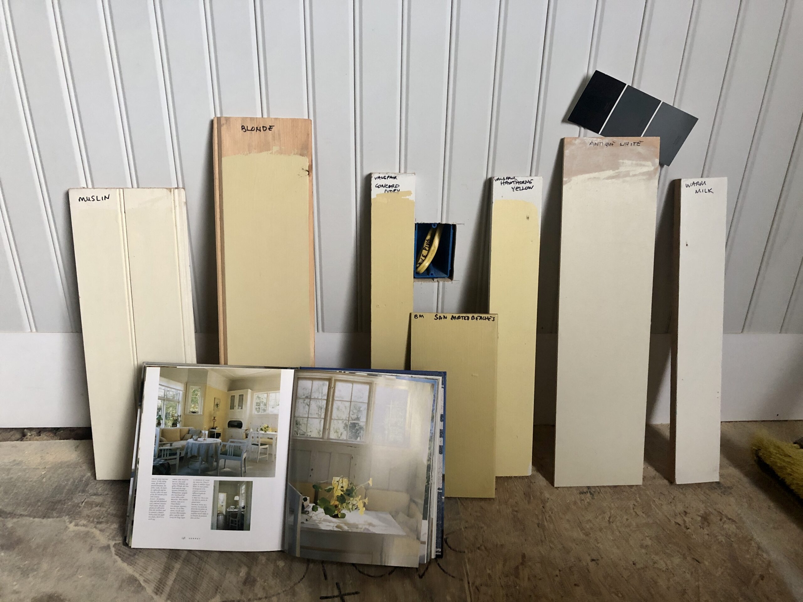
The narrow one on the left is Concord Ivory, and seems closer to the two other darker yellows, but actually is not that far from the Hawthorne Yellow (old yellow of my kitchen).
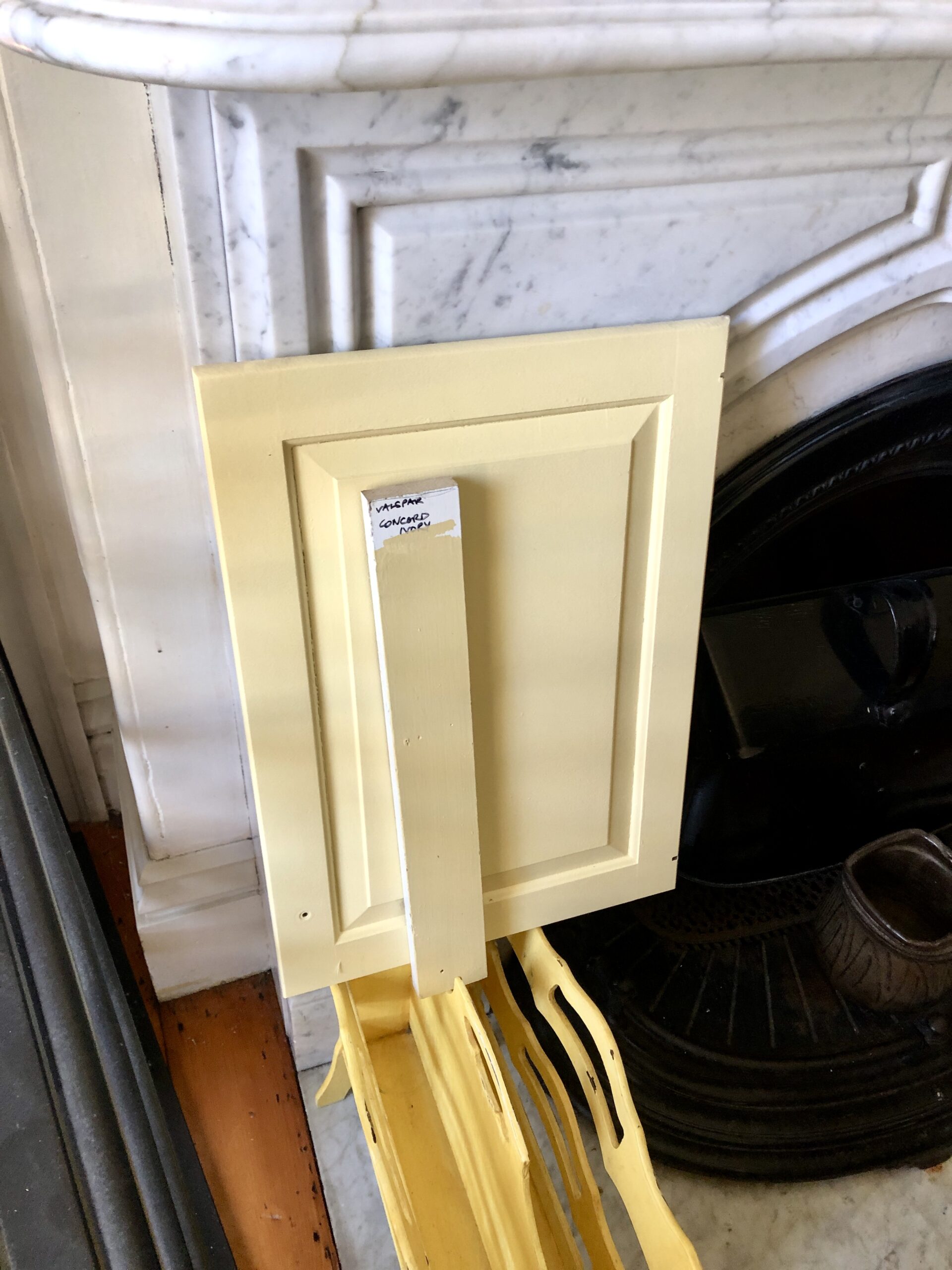
That cabinet door was from the old kitchen and had been kept in the closet (you will remember that we took some doors off, but didn't want to throw them away in case a new owner wanted them, not that we were ever moving). So it's pretty new looking, or at least represents how the paint looks when it's not super fresh (it always darkens, so swatching is tricky).
Here is the kitchen before:
You can see that the Concord Ivory, which seems much darker (browner) on the chip and on the swatch, is not too far, really.
I have the samples there by the fireplace because I am pretty sure I want soapstone counters, but am considering marble as well. However, I think (as I discussed here), marble, so beautiful in itself, is very hard to match to any white that isn't just white or gray, and certainly yellows are really tricky with it. So easy to make everything look cold, and my kitchen is already actually cold for so much of the year! (Though it will definitely be brighter and actually warmer when this reno is done.)
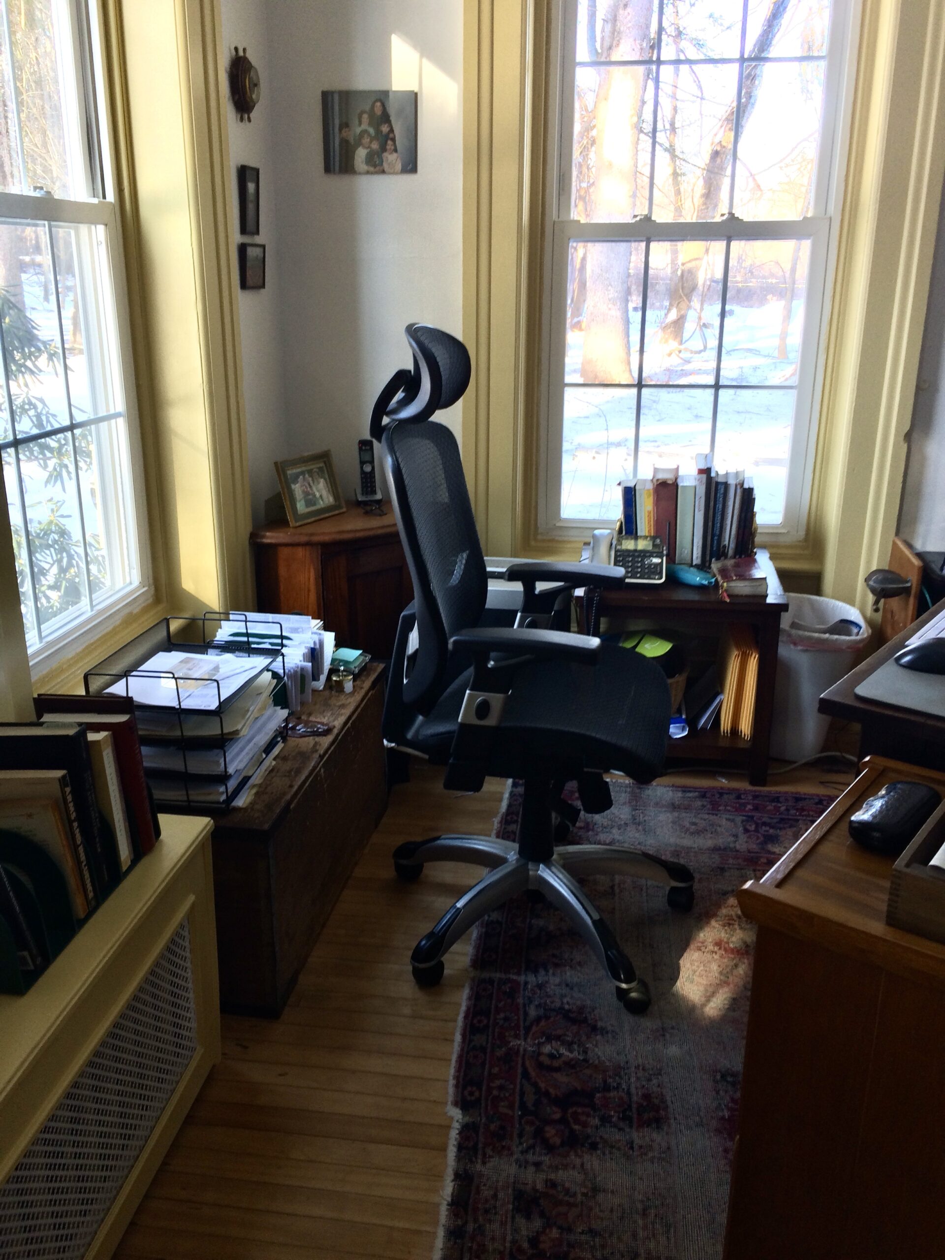
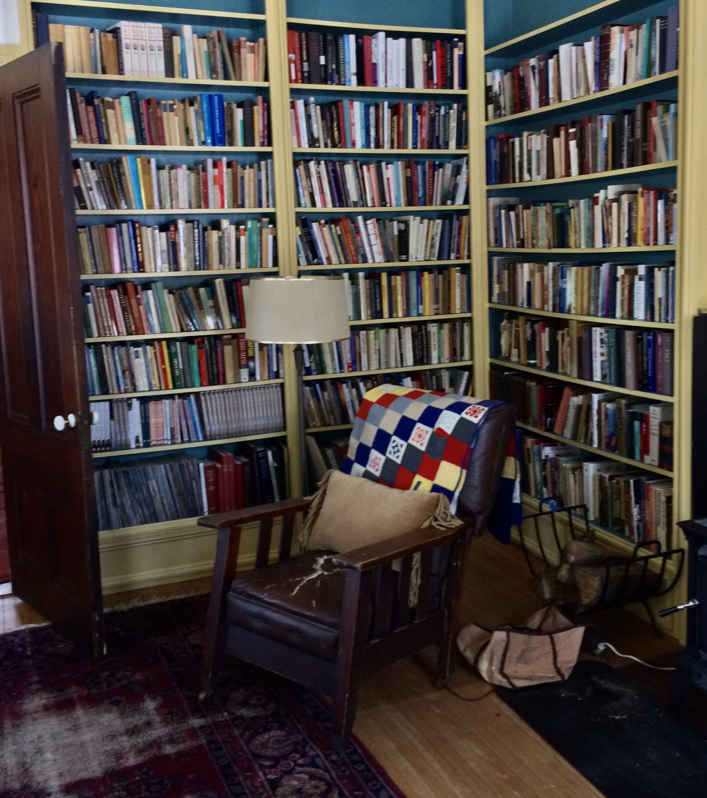
Of these colors I've swatched here, the shorter wider one is actually the trim in The Chief's office! Which is so funny — I was asking Bridget how we chose it (she did the painting in there), and we couldn't remember. But “San Mateo Beaches” is not a name you would think of for an 1860s New England study!
It looks great though, with the off-white walls and the blue of the bookcase interiors.
I should take better pictures but oh well!
What else did I want to say…
Having all those samples (I think I have 12 altogether!) has revealed to me that I actually do know what colors I want. They are pretty darned similar in their respective categories! The challenge is to pick an off-white that isn't just… white, which most of them tend to read in that space.
Soon I will graduate to painting the runners up on the bead board, so stand by. Thrilling, I know!
Training Your Eye Corner
Most of us have a home that is somewhere on the spectrum of “ordinary-and-fine-to-pretty-nice” — not super fabulous Cotswold Swedish French Tuscan Nantucket Country Cottage/Manor and certainly not Perfectly Decorated to a T. But as I have said often enough before, the virtue of examining the style of the former is that it trains our eye.
Robert Kime was a decorator who wasn't out to do anything weird to call attention to himself as a decorator. He didn't even think of himself as a decorator, even though he designed the interiors of royalty!
He actually talks about the mysterious quality that objects of (often ordinary) beauty can have and how we can come to spot it, in the video you will find on this page. Some of his things are certainly valuable, but he makes a point of saying that they are not so valuable that we couldn't come across some of them ourselves, or something like them in our own context.
We too could collect things “and put them in a room and make them feel special.” Probably not as many gilded things, and, well, not as many things! I wonder who dusts them all…
But still, his aim was to make things comfortable; he said a room “should have interesting things to look at.” That it should be fit for a life. Echoes of Roger Scruton there… Anyone can poke around in a junk shop or hunt down vintage items that are made of real materials; we all have little objects we brought back from a trip, however local (even the shells and rocks the children can't help hauling home!) — let's make our homes redolent of our memories and imaginations.
bits & pieces
- You can read the obituary of Robert Kime here, or if you are not a subscriber, here. The photos in that piece are super grand. On his website there are more approachable ones. I think we can take his process and make it our own, when we need to figure out what to put in a room! We can at least be liberated from the thought of things needing to match.
- As you know, I'm on the hunt for some decorative tiles. This one company I follow has historical tiles and also is launching a line of reproduction ones (which is good, because the historical ones are as pricey as they are gorgeous). I loved this post on their IG that describes the process of hand-painting the tiles!
- Speaking of ways of doing, I recently came across the idea of “tree hay.” Turns out it's an ancient way of feeding livestock. This video seems like it could be boring, but it's actually so interesting! It's a look at the history of pollarding and coppicing trees to feed animals and allow them to self-medicate and -supplement. The whole family could watch this: Tree Hay, a Forgotten Fodder
- An important read: The Bad Divorce by Elizabeth Marquardt
from the archives
- If I had a kitchen, I'd be baking some bread
- Ask Auntie Leila: Using affection to discipline (spoiler: don't)
- Not an LMLD archive, but have you visited my “Bad Pinterest Board” recently?
liturgical living
follow us everywhere! share us with your friends!
My book, The Summa Domestica: Order and Wonder in Family Life is available now from Sophia Press! All the thoughts from this blog collected into three volumes, beautifully presented with illustrations from Deirdre, an index in each volume, and ribbons!
My “random thoughts no pictures” blog, Happy Despite Them — receive it by email if you like, or bookmark, so you don’t miss a thing!
My new podcast can be found on the Restoration of Christian Culture website (and you can find it where you listen to such things) — be sure to check out the other offerings there!
Stay abreast of the posts here at LMLD, when they happen:
Consider subscribing to this blog by email. In the current situation, if we can’t meet here, it would be good for us to be connected by email!
We share pretty pictures: Auntie Leila’s Instagram, Rosie’s Instagram, Deirdre’s Instagram. Bridget’s Instagram.
Auntie Leila’s Facebook (you can just follow)
The boards of the others: Rosie’s Pinterest. Sukie’s Pinterest. Deirdre’s Pinterest. Habou’s Pinterest (you can still get a lot of inspiration here! and say a prayer for her!). Bridget’s Pinterest.

Good morning, Auntie Leila~ I so look forward to your Saturday posts! Lots of things to read and ponder–and colors for your new and improved kitchen? I love it!
For my part, I am enchanted by the yellow you already had in your kitchen-in no small part because I picked the same color for my kitchen, dining room and living room in our former home. It is a creamy, warm and elegant color. We had long, gray, dreary winters sans sunshine, so my walls were my sunshine for about 5 months. Our new {to us} home has log walls–for which we are grateful beyond measure!! My Darling Husband and I dreamt about living in a log cabin even before we married over 32 years ago, and now, God said yes! We are truly blessed. If I am ever able to remodel the wallpapered space of my little vintage-style kitchen I would paint it the same gorgeous yellow–it is simply perfect. {It is called “Soleil” by Sherwin Williams}
As a small note to your search for a good white, “Simply White” by Benjamin Moore has creamy almost yellow/golden undertones–and it looks clean, classy and comfortable without the gray cast that so many whites seem to have.
The mustard yellow may be avante garde–but it looks dirty and muddy to me…just my opinion! 😛
Enjoy and hope all the work gets accomplished quickly so you may bake bread and make pickles!
I agree about the mustardy tones because Auntie is just getting g her new larger kitchen window to let in more light it seems a shame to muddy things with any drab tones.
My opinion is that you cannot go wrong with Hawthorne Yellow by BM!! I feel like it’s the perfect yellow! 🙂
We bought a house with yellow kitchen cabinets and I love them! They’re a paler yellow than your old ones, and the maple grain actually shows a little under the color… so maybe it’s a colored stain. I think they make the kitchen quite cheerful, especially since it’s a dark room – the window looks east, but there’s a wooded hill, so I only enjoy a bit of sun when the leaves are gone. The cabinets were paired with a lovely speckled, sandy-colored countertop, maybe a sandstone? Corian? I really know nothing about all this! There is no backsplash, just the wall, and I painted it a blue that I thought went very well with the yellow. I’ve lived with this kitchen for 12 years and I still love it, I don’t feel any urge to change anything (except the nasty ceramic floor, but I’m afraid that will never happen. I’ve toyed with the idea of painting it, but I don’t have faith that it would survive all the foot traffic.)
All this to say yellow can be a very beautiful color in the kitchen, and I for one would gladly buy all over again a house with a yellow kitchen.
My current spiritual reading is Father Faber’s Growth in Holiness. I think it’s a book everyone should read – he explains so well the traps we fall into while seeking to become holier and he teaches how to think about them (and about ourselves as we go about observing and judging our every thought and deed, seeking affirmation and reassurance that we are, indeed, becoming holier!)
Your decorating taste seems very similar to mine. I used Stowe White by Glidden on all the trim and beadboard in my colonial home and after almost 20 years, it still works beautifully. I do enjoy your blog and wish we could’ve been friends 30 years ago when little ones were tearing through my house!
Can I just say how impressed I am that you remember a paint color from 20 years ago? Brava!
Love your kitchen plans. I think my favorite is the yellow on the far left, but I can’t deny your original kitchen looked amazing.
Thanks for the article on divorce. My parents got divorced 5 years ago and it’s been hell and I’m a grown women with children of my own. I think there is a lot to say about children having to stuff down their feelings and only consider their parent’s feelings. Some of the kid’s I’ve talk to have said things only those lines. Both my parents have wanted approval for their poor actions and that has ended with distance between us, with my mom and I still being estranged. Yet everyone seems to just think I need to get over it🙄. Definitely forgiveness, but I’m not just going to get over it. However, I do finally see some light and possiblity to move forward for myself. Well sorry for the saga, it’s hard to talk about when everyone seems to think you should be fine with it.
Dear Vera, the hurt is so real. If you haven’t yet, please read Leila Miller’s Primal Loss. You won’t want to, but it’s hugely important. And your husband should read it too. Mine said it helped him understand me better…
There is an Orthodox priest who has just come out with a book on shame and bearing a little shame. He has a blog too. I haven’t read it yet but I hear it’s fabulous and perhaps you might be interested too? His name is Father Stephen Freeman and the book is called face to face: knowing God beyond our shame.
I love Benjamin Moore San Mateo Beaches!!! It takes on a different personality based on the lighting in each room. It is the color of the walls in our church and every room of my house. So many people at church have called through the years to ask the color (I work in the church office).
I’ve been thinking kind of the same lately! If one is familiar with traditional spiritual writtings, eg. carmelite spirituality, it is unbearable to read contemporary titles we’re “finding yourself” is the aim.
Yes, I have visited your “bad pins” board– “just say no to macrame” makes me smile. Agree 100%. (what is wrong with the baby bracelet in a Christmas ornament, though? I had a December baby and did that. It’s prettier than that one you pinned though…. no hat…)
Parisienne Farmgirl talks about Robert Kime a lot. Have you ever seen her videos/blog posts? Her look is a bit much for me, but I do love her kitchen.
fwiw I like “antique white” and “muslin” most of those swatches, though I do think the Hawthorne Yellow is lovely in your current kitchen and the Chief’s office. I am sure whatever you pick will be great! Yellow, in general, is just perfect for a kitchen.
I won’t comment about the ornament! De gustibus and all that! I’m sure yours is prettier!
I learned of Robert Kime from Laurel Bern’s blog. Her style is so real. Too formal for me, but classy!
It’s funny how VERY close all those colors are — the antique white is just a bit lighter than the muslin. If you saw the muslin on the chip you would think it was mocha! But it reads quite white in the kitchen.
FYI in the Chief’s office it’s San Mateo Beaches (couldn’t tell what you meant), which is darker than Hawthorne Yellow and also a tiny bit green! Which is what I think makes it go so well with the blue in there!
A cream or off white I keep returning to is Benjamin Moore “Cream Froth”. It’s rich but clean to me: not overly yellow or pink. We just put breadboard in our lower level family room- even the ceiling! And when mulling over colors, I decided why mess with a good thing? It took me forever to select it the first time 10 years ago & it’s now in 3 rooms, even if just one wall. I almost, almost had the trim painted painted in it this time! I love seeing all your projects & finds & am happy you are finally reconfiguring your kitchen for more ease & prettiness for you. 💛
Hi Leila,
I have a yellow in my house that I really like, called “White Raisin,” by Sherwin Williams. Definitely not a mustard toned yellow, but not bright either– subtle, with some warmth. The color chip looks nothing like the actual paint in real life, sadly, so if you don’t have a Sherwin Williams around, there is not point in looking at it online, but I do really like it!
I also like the yellow that you have had in your kitchen all these years.
I think that is similar to the one on the left called “Blonde” — on the chip it looks like it’s brown! But it reads as a strong yellow. However, my kitchen is on the dark side and I think I need to go lighter, even though those deep yellows are pinned all over my boards!
I love the idea of each room having something interesting to look at. I recently realized that the priorities I have for my own home to feel comfortable to me are: books, quilts and art. We’ve recently started framing our kids artwork in nice frames and hanging it up (it’s original artwork I can afford, and I do consider it “real” artwork), and I love looking at it. No one else has it in their home, so it’s special and unique. It is definitely interesting to look at
What a lovely idea! I imagine your artists are delighted to see their originals framed and hanging~
Love the look of the bead board on the ceiling! It gives it such a warm and cozy feeling. Look forward to seeing your new gas stove in the fireplace. I grew up with a fireplace in the kitchen and have so many lovely memories of family gatherings in that space.
Hi Leila ,
I think with a 5 year plan ( we are there too !) anything you do with your house should have a clear nod to idea of possible resale… that being said I’m going to be an unpopular commentor ( please don’t hate me ) here . Stick with antique whites , I second Benjamin Moore Simply White which is a creamy yellow white and Chantilly Lace for a crisper trim . We have both and love . On another note … I’m in my early 60s purchased Primal Loss 3 years ago and still can’t bring myself to read it …. Sigh . Jo!
Jo, it is a difficult read. I don’t say this to discourage the reading, just to say, “brace yourself” and maybe only read a little at a time. I got through part of it and had to stop. I have wondered for myself if taking this to Eucharistic Adoration (don’t kill me, people, for suggesting this) and reading it with Jesus would make it better. It’s poking a wound I don’t often recognize or acknowledge and He is the Great Physician. But perhaps this is anathema to take such a book to a Holy Hour. If so, my sincerest apologies!
Bethanne, I think it’s a good idea. After one’s mental or meditative prayer, doing some reading and pondering is a worthy occupation there, with the Lord. Read it with Him!
It is good to bring such things before the Lord! I think it’s a great idea.
Jo — just open it in the middle and take a peek. It turned out to be very different from what I thought it would be.
Auntie Leila- go find @clairebrodydesigns on Instagram- she posted a picture of her yellow kitchen that made me think of you. In the picture everything’s yellow (walls, trim and cabinets) but looking at it, I feel I can picture what it would look like with yellow walls and off-white/warm white cabinets and trim. It is very cheery looking!
I appreciate your recommendations on spiritual reading. We bought the Newman book on your advice. I know that since the early blogging days I have found myself reading the spiritual musings of various Catholic Influencers (or listening to their podcasts) and, though they sometimes give me comfort, I have realized that they usually amount to someone’s personal emotions regarding their own experience of God. I find it a dangerous place to get nourishment for my spiritual life because my own interior life is largely affected by my personality, my particular sin problems, my experiences, etc. But, when I stick to the writings of masters like Newman (not necessarily theologians, or even many accounts of the lives of the saints, which can often be too….sentimental? Or overly sweet?)—I receive more of an application of the Faith itself to life in general and the typical struggles against sin that most of us deal with. The blog/social media route often leads me to comparisons of my emotions to someone else’s…not a good path, in my opinion.
On paint colors, I admit to being highly influenced by the names of the colors! We chose a yellow for our kitchen, great room, entry (and throughout the hallway too) that had the word sunshine in it, or something like it, and I love it. Our cabinets are more of a trim color. Our dining room color had the word sky in it and is a soft blue. Also, we have a little breakfast nook that looks onto the backyard and we did a green in there that makes it feel like you are sitting outside—but I don’t remember the name. There are zero white walls in our house and I am so happy!
This sounds like a great way to ask for the Great Physician to help you heal these wounds..I need to read this book, too. Thank you for your recommendation to read a “little at a time”. Sigh..it might be time for me to get this….God bless you all who are working through this pain…and your families, too.