
The problem, besides distraction, is that, when presented with a million images of million-dollar homes custom-decorated and professionally styled, we — you and I — maybe tend to feel like it's not worth it, and we lose sight of our real purpose in the decorating sphere.
Well, there's a special issue here in this room, which is the dang lovely fireplace. It's all very well to romanticize about bedrooms with fireplaces, which I did for ever so long, and probably still do, truth be told. And it's all very well to want to paint everything yellow, which I do, because it's so dark here. But the dead gray marble and the bright yellow (on the walls when we arrived, way too long ago for it to be acceptable that we didn't get around to painting) I found not a great combo.
 |
 |
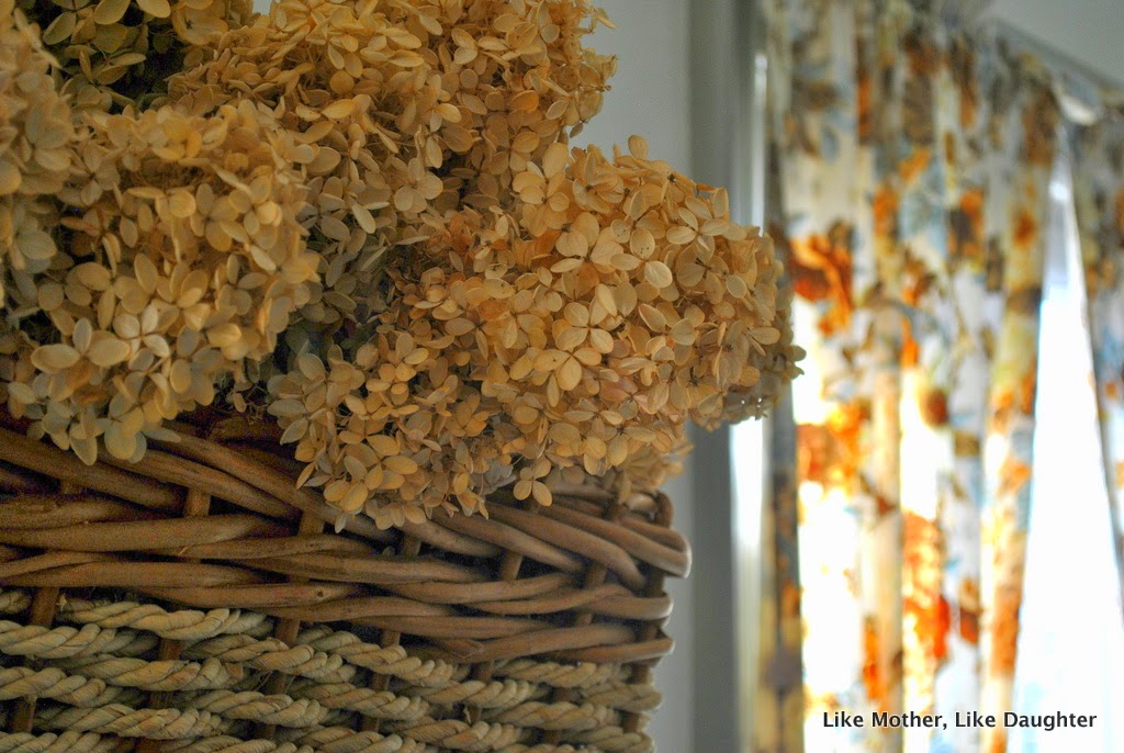
| As you can see in the photo below, normally our bathrobes and pjs are on those hooks, because they need to air out in our somewhat damp house. But for the purposes of the post, I took them down. This time. The lamp is from the side of the road. The little afghan was crocheted by Habou. |


 |
| My scarves are a bit out of control, I guess. |

 |
| That mirror is so astonishingly heavy that I don't want to hang it! You can read about why there is an open ring box on my dresser in this post. |

 |
| It's all about that fireplace… |


Yes, the yellow (well, not that yellow, but yellow) is cheerful. You know I think that. But given the curtains and the fireplace, and the fact that this is my bedroom where I need to feel calm, I think the white is an improvement.

I like the after waaaay better! It's fresh! And clean! And calming in a “cooling off from a hot and tiring task” sort of way! Perfect choices of colours, I'd say!
Del Coronado Tequila??!
I find this a truly hilarious name for what is, in fact, just white.
After all, nothing says “party” like really light gray, right?
I think it looks great.
Dear Auntie Leila, This is just lovely. What a sweet son! I think you have invited the fireplace back into your bedroom. It looks smashing! We haven't done any painting at our home lately. We have lots and lots of books and a small abode. So every room has its share of bare board and utilitarian bracket shelving. With its share of books. The children would like me to leave for a long day out so they can remove all the books off of the shelves and paint them the wall color and add the trim to finish them. I should just do it. It would look so nice to have them “finished”. Ok. I will. You've inspired me. Now about that post on young adults still in the home……Best regards-Jamie
Jamie — I do feel like the fireplace popped after the paint job.
And now you know the secret about the young adults in the home! — a long list of jobs and get them moving on it. Those older kids will work with you and for you and with their superior strength and energy be better at it all. And then you just enjoy their company!
I definitely like the “after” better! You've inspired me with the gray trim. I never thought to do that, but it looks awesome with the white walls!
I love yellow, but not in the bedroom! I love the colonial look of white/gray and it really looks lovely with the fireplace! I laughed out loud when you wrote: “because why be reasonable” because, oh my! That is me, too!
I have been trying to figure out enough time/energy/nerve to re-paint our master bedroom…its current color is super dark red–like a merlot wine….I thought it would look very cozy, romantic and inviting, but my Sweetie says it reminds him of dried blood….ugh…time to change!
I HATE committing to paint colors!! We lived with four swatches of color on our living room walls for a year…before I finally decided to go with none of them and pick a rogue color and throw it on the walls. Thank God – it looks great.
In southwest Florida though, we have the luxury of painting some rooms deep forest green – and that room is still the brightest in the house since it faces the southeast. If anything, I've made it livable so it doesn't hurt you eyes every time you walk in (the back wall of said room is one gigantic sliding glass door).
I think the after looks much nicer! You were totally right about that gray and that yellow clashing. Also, I hope someday my own “rotten sons” (haha!) will paint for me! 🙂
The after is much better. I'm not generally a fan of white walls (when we moved into our home, we had all white walls, and white tile floor everywhere, ug the echoes!), but I can see in this case it works well. It brightens the room up quite a bit.
I've been hoping for a post from you today. Somehow it just helps me cope to know others have been there. Especially the little piece about our children getting older and actually being a help and not a hindrance. OK, trying not to dream these days of little ones away…. You know what I mean right?
I like it better now. Having trim a little darker than the walls adds a nice dimension. It's taking me forever to finished painting some areas in the kitchen which were sky blue and now to be cream. I have to do some molding at the ceiling. I'm not good at painting; when you get close you can see drips in places, but I really am doing my best.
Your black furniture looks good in there, too. Am I right in guessing that the lamp from the side of the road was painted black by yourself?
Yes, Lisa, I spray painted it — but it's not black, as I remember — it's a dark brown metallic paint. I'll have to check. In any case, it's very dark, and I got those black shades and that big bulb. It's a good floor lamp!
Lisa, I looked at it again closely (I mean, who remembers what random things are painted, even with a picture in front of you and also that you look at it every day, albeit usually it's pretty dark in there), and it's that metallic bronze spray paint from Lowe's. I have it on my deck furniture too. I really like it.
Oh how I love these chit-chatty posts!! I hate commiting to paint colors too. A friend always says that if I hate the paint I can always re-do it and I just groan… no way am I painting a room twice! Twice the cost-twice the effort? NOT happening!! 🙂
The new colours look good; subtle and calming. Here in the UK we have a paint company called Farrow and Ball which sells heritage paints with hilarious names. My favourites are “Mouse's back” and the hysterical “Drab” (!). But they look really good.
Rachel, what funny names. Drab, tequila, it's all white when you put it on the wall!!! 🙂
Just thought that I would chime in with how nice the bedroom looks and how I hope that my children paint my rooms when they get older. I love the splashes of color in your curtains and scarves and such against the white walls. Very Pretty.
We painted the front door of our new house red. I hate the red that we chose and now am afraid that I may have to live with it until spring and the weather warms up. AUGH. This red looks great in the shade but in sunlight it looks just like safety red spray paint. Just curious, do you remember the red on your front door?
Betsy, I will look. It's Benjamin Moore oil paint, and it's a stock color, I'm pretty sure — dark red. I'll try to find the color and report back here.
I too feel that a yellow bedroom is a little too chipper, and like the white and gray better. My mom and I just painted my kitchen cabinets – it wasn't so much the paint choices that gave me palpitations as the upheaval. We survived, though (and ate out far more than I wanted to)! It helped that my mom had just painted her cabinets a year ago.
Choosing paint colors is SO HARD! I do like the after better – and most of my house has yellow in it, so I love yellow. But my bedroom is a pale blue grey – so tranquil.
We have the taupe/grey color as porch floors (and once, before we agonized and chose a proper pink) as living room walls. We call it mushroom.
I love the grey/rust that I see in your room. Maybe that's not what is actually going on in there, but that's what my monitor shows. It's got warmth and yet quiet elegance with that marble. Great look.
I think it's wonderful! And the curtains…perfection. Seriously, you just don't find patterns that good anymore.
I have some sheets that are rather lovely and very similar in shades/patterns on our guest bed. Everyone comments on how much they love the sheets-they were a dollar at a rummage sale! Come to think of it…all of my favorite things were free or from a rummage sale….huh. And yes committing to pain is agonizing. Everyone tells you “It's just paint!” But lets be honest paint is NOT cheap.
We recently painted our living room (and some other boring work) and it is amazing. We basically just went a shade or two darker from the neutral light brown/taupe color we already had and kept the trim white. It looks so much better and warmer.
As for yellow, yellow is tricky. I think it's best to stay away unless you are an actual decorator, and know how to add all those little touches to the room that fixes those things, or else doing it in the bathroom. I said this on that last post on yellow, but yellow is, I heard on the internet, the only color that our eyes will never adjust to or be able to block out (it's so often a warning for poison in nature, after all) so it always insists upon itself when you go into the room. If you paint your room too bright yellow, you will never “get used to it.” Our living room was bright yellow for a while and my experience was that it was true.
I LOVE your room and I love your curtains with it. I love the mixture of gray and brown. I see exactly what you mean about the marble and the curtains. Gorgeous. I love that fabric. And the hydrangeas are perfect.
elizabethe, I have yellow in the kitchen and a dark yellow/orange in the hall — but they are historic colors, so they are mixed just right. I do love them both. For a long time I was sure I wanted yellow in my room, but in the end, I'm happy with my tequila 🙂
“happy with my tequila” — for days when “happy despite them” isn't quite enough… 😀
love the colors and the curtains especially!
No trusting necessary. The after shots are a big improvement. Really stunning color for the trim! Most of my walls are a light cream with a tiny hint of yellow, but I chose an airy blue for the bedroom. Sets it apart, I think. I still covet that gorgeous blue dresser thing of yours! If I ever find something similar I will snap it up in a heartbeat. Great Job!
The grey and white are so restful – and the bits of yellow in the curtain and chair cover give just enough zing to keep it from being boring. I love it!
I had the living room, loft and both bedrooms painted ten months ago (no sons to do it, and lofted ceiling meant I had pro do it) and agonized over the colors until the night before I had to get the final choices to the painters. I just put up a post with the “after” pictures of the living room this morning. It still sounds odd to say the walls are brown…but it works (my fireplace surround is black ceramic tile – had to work with that)
“because the only thing worse that living with something you actually think is ugly (the color combo) is choosing something you hope will be better.” – what a well written & so true statement! Although – incidentally – I have no problem choosing colors but get hopelessly stalled on all other decor-related issues (deciding to hang a picture can provide more than a year's worth of procrastination & decision-paralysis in my house!) Your new paint looks beautiful.
Have you ever researched painting marble? Just a thought.
Love the after.
I am with you on the “historic” paint colors. I had a very hard time finding the right cream color for our bathroom until finding Valspar's Churchill Hotel — perfect!
I think painting a room is like getting a haircut – it's not necessarily forever, but you're going to have to live with the results every day for a while, so doing some research and investing some resources in the project is probably going to pay off!
We just painted our former guest room/office/storage/laundry room in the process of making it over to my daughter's room. It's white on white. I actually have a thing for white trim – here I stomp around demanding “who would paint wooden trim GREY?!” Yet in your pictures it looks beautiful. Maybe ours is just the wrong shade of grey (and cigarette stained from the previous owners… Yuck!).
At the moment I'm just painting everything white. I went through a color phase and the only room I don't hate the color of is our living room, which is a pale beige (with white trim). Everything else I got tired of in short order – sick to death of it. My kitchen is a sort of robin's egg blue/green and I just wish it were white. White doesn't look as fancy in pictures as coordinating colors, but it's restful, bright (we live very north), easy to decorate and easy to paint over if it gets dirty.
I honestly think that the “after” is better. Fits all moods!
I do postpone painting walls, changing curtains, and hanging wall decor for fear of the bad getting worse. I'll never know until I go for it, I guess…
Congratulations on your decorating success!
I think it came out very well. I've been dawdling on painting my bedroom, too (five years here). Our house is a “partial berm” house, which means that it is basically a basement with an attic on top, and our room is in the most basement-y corner of the whole place. It is dark, with only one tiny basement window to let in any light, and it's hard to make that window look like a real part of the room, though I have an idea from pictures on another blog. The room is right now an odd sort of grayish lilac, but because of the light, everything looks gray most of the time anyway. So I was thinking of just going ahead and painting it gray! Or a nice beige called Acapulco Sand which, I discovered yesterday, I already purchased some time ago. Or maybe a particular shade of blue or green which looks nice when it looks gray, too. I'm indecisive on this particular color choice, but committed to painting it this winter before Baby No. 8 arrives. 🙂
I love your after! And I don't like painting…well, the painting part isn't so bad; it's the choosing a color, prep and cleanup that gets to me.
Beautiful, but I did like the yellow too so I'm probably not much help (sorry);. The fireplace is romantic even if difficult to match with any sort of decorating style. I would love a fireplace in my bedroom, right now it has become the family drop zone and I need to reclaim it! Thanks to this post, I'm feeling inspired!
“There's something about the unlikely color combination and the hopelessly bygone feel — like the spirit of a wee cottage wandered into my 19th-century marble-fireplaced behemoth of a house — that have captured me. ” I love that line! The trim is especially beautiful, it looks lovely with the rich wood tones of your door. Thumbs-up!
It looks wonderful! I'm starting to feel inspiration bubbling up – I have a half-finished WC that is driving me crazy!
I love the crucifix above your bed!! We have a small one in each room – all gifts from our parish to each one of us when we entered the Church, but, while perfectly nice, they are predictably small (predictable if you live in Japan, anyway!). I have visions of a large ornate one adorning our wall some day, even if I have to haul it over here in my carry on!
So why'd ya have to get all “reasonable” with the addition of a little Woodlawn Colonial Gray? I've been pining for a lovely soft gray for the trim in my dining room and your trim looks perfect! So did you just pour a little in, or was it mixed with an actual paint mixing recipe? I think I know the answer to that and I don't like it. (;. Also, I have always loved those curtains and actually shop thrift stores to find something similar. Funny, huh. If you ever want to sell them, you know how to find me. I just love that peaceful room!
Lisa, I first went with the taupe, but it looked too brown to me. And I didn't want flat gray, which is very battleship-y to me and also, the floors are gray. I am not a fan of gray, as you know.
There didn't seem to be a chip that was just what I wanted (of course). And the light in there is so odd, it was hard to know what I wanted….
So I added a bit of gray to the taupe so that it would really be taupe, and it was.
I think Will painted the moldings with the taupe, and then added the gray to what was left and put another coat on (they needed it anyway).
The next color up on the chip from the Oatlands Subtle Taupe is Smoked Oyster, and that might be just right, but it might be a touch too dark.
Thank you!
I like it both ways, even though I would be afraid of the new colors looking too cold during winter. But you know your room, and maybe your bedroom is happily sunny, so you don't need warmer colors anyway. Don't despise your windows!! They do pose a challenge, but they bring your beautiful outdoors in – they are an integral part of your decorating! I don't have such big windows in such abundance, but I do end up with the same problem: our first floor is too open for my taste, and I don't have enough wall space for bookshelves, and not many options for arranging furniture… Also, your doors are so so beautiful, by the way!
As for picking paint colors, I hate that we agonize so much picking the right shade, and yet when the job is done we think it was all a bit silly, all that anxiety – at least, I think this way.
This reminds me of the funny scene in Mr. Blandings Builds His Dream House when Myrna Loy tries to describe the exact colors she wants her walls painted (“not a hospital white”, “a pound of their freshest butter”, and the green that must be not too yellow, not too blue, nor too gray…), and the painter lets her go on forever and then writes down with a roll of his eyes just basic colors: green, white, yellow, blue… Funny!
I love that movie and Myrna Loy so much!
Mrs. B, that is so funny, and could describe any conversation about color between me and Will.
“The problem, besides distraction, is that, when presented with a million images of million-dollar homes custom-decorated and professionally styled, we — you and I — maybe tend to feel like it's not worth it, and we lose sight of our real purpose in the decorating sphere.”
You said it sister. I've been thinking these very thoughts lately, as I've caught and HGTV home make over episode or two. Don't get me wrong–I love watching them to see what the designers do, but I have to put the mental brakes on after it ends and see my house for what it is and what I'm doing, which is raising four small children, not making a show piece for a television show. And our house is very nice. Of course, there are things that bug me, my list of things I'd like to aesthetically update in the next few years grows as we've been here for a while, but we'll get there!
Your bedroom looks great, by the way. I'd love to have so much space to have a whole chair in ours! (We can just squeeze around the end of the bed. What can I say, our house was built during the Victorian period when furniture was smaller and closets were extremely optional. Read: we have two in the whole house. But we're making it work!!
I painted (am painting) my library B.Moore's Daisy Blue. It took me three years to decide on that color, and, it's quite a commitment.
You see, the diningroom is blood red with cream trim. Both room shave huge fireplaces (old Victorian) So, see the problem was when you opened the front door into the library (which I guess is technically the parlor) you look through the room into the dining room–which is red. I wanted to paint the library green (of course, for us a library is green) but then you'd look through the green into the red and have…Christmas, 365. We couldn't go light green, all of the woodwork and pillars and built-ins are *dark* wood, all original and I was *not* painting them white.
So, Daisy Blue it was.
I have a goal to have it done by Christmas, and I'll get the pictures up. 😀
I like the white and gray. I think the icing on the cake would be blue and white curtains (I know – not in the budget). We only have two windows and it was hard enough to find something cheap I liked. What I have is something different on each window – in the same color scheme but different patterns (one was a sheet and the other remnant upholstery fabric). I didn't have to worry about the walls since they are knotty pine. I didn't think I'd like the walls at first, but they've grown on me (like your vintage curtains) and I like their warm, rustic feel now (but my dream bedroom would still be white and blue).
We are hoping to paint our master bedroom soon, and I am trying to decide on a color. It's so hard to decide! And you are right, a big commitment, I think. Painting a room twice is not something I'd like to do.
I love your blog…..thank you for faithful encouragement, especially to mothers at home raising children. A new post on your blog is like getting a new magazine in the mail! I save reading it 'til naptime coffee!
I think it's amazing! The yellow made the curtains too matchy, matchy. Now it “goes” perfectly, and the gray is so soothing. I'm seriously considering painting my blue room gray.
The 'After' is the perfect choice wall color. You know why? by blending with the fireplace, and the back ground of the floral curtain, all the warm tones (oak, cinnamon) pop out, and your eye SEES them. Before, it was a bland low-contrast yawn. Which you knew in your heart. Worth every minute you stressed over.
Beautiful, and Warm. Thank you for sharing this.
Having a nice bedroom is so important for us big people. It is often one place we can go as a retreat! Yours is so lovely.
You must have hit a “sore” spot with man, since you received so many comments on this universally problematic problem of choosing a paint color! I myself, though “color-phobic” prefer the suggested happy color of the before. Sorry~!
I love painting, always such a great before/after kind of task! I love your room, very modern and yet classic at the same time. The neutral wall and trim totally helps make the fireplace stand out rather than clash.
Great job! I love the new look of your place especially the fireplace. I wish I had a hearth in my home. By the way, if you are looking for other interior design idea, you can see it here. I wish this helps.