

We juuuuust finished painting (and cleaning up) the dining room, but I know that the entire interwebs simply cannot wait for us to do one more thing before knowing how this amazing transformation has turned out (at least so far), and needs to exhale. So here you go!
It's just that cleaning up takes much longer than you think it will, particularly when you keep chucking in things like fiddle camp. Do not expect every little thing to be finished up here.
(“We don't, we know you.”)
(“Oh, good.”)
Also, do not forget this fabulous marriage prep course! Win $50 off for yourself or a dear one! What a great wedding gift! Promoted by Archbishop Chaput, accepted nearly everywhere, faithful and orthodox, and personal. Click this link and leave a comment!
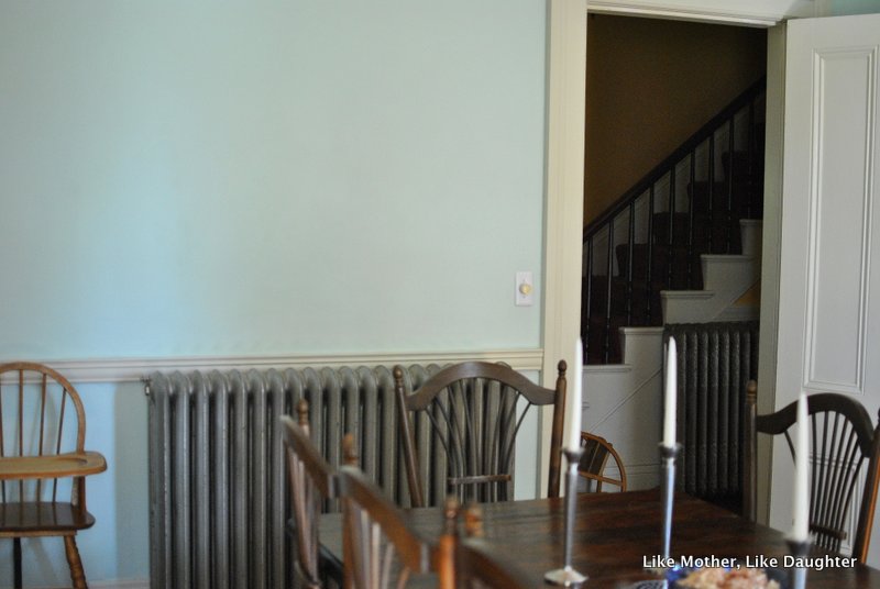
Now, I am on record as being totally against blue and also gray on walls. However, I really, reeeallly needed a color in here. And the fact is that these old houses need a little (not a lot! not actually dark!) gray in the paint to keep the paint from looking harsh… and I needed a good background for the gold in the little oratory… and something for all the brown of the furniture and mustard yellow of the curtains to stand up to… so blue it is. (Paint info at the end.)

But it's really a blue-green aqua kind of a color, and when the light is on (as it will be at night, when we are usually in here), the yellow from the bulbs and candles make this color look quite green, actually. A sort of sea-foamy green.
Bear with me while I babble…
I am having a hard time actually zeroing in on what this color is. If you like it, then it's what you see. If you don't like it, rest assured that it's a quite different color from what you think! I mean, every hour and every angle makes it look different. I'm a bit stumped as to how to convey it to you through this computer.
Anyway, here are some BEFORES:


It was a sort of stone-colored white with a darker stone-gray trim. I liked the trim a lot, actually. And I'm all for white, I really am. I like light and I like to think that textiles and artwork are where you will put your color infusions.
However, the tallness of the ceilings and the sudden need I had for color made me do this.


The view from the kitchen, which is how you are normally coming into this room, as we rarely if ever use our front door (which would bring you through the living room like regular people):


Now, at the start of this post I gave the disclaimer that it's not quite done yet. Of course. I realize that many people decorate by having a complete vision and then boom! Decorating occurs!
But that is not my way. (Can you tell?) On my deathbed I will be wondering if we should maybe do something different…
So I am not sure about how the quite colonial-style chandelier works in this decidedly 19th century house, but it will take a while for me to figure out something I like better.
And here I think we could use some sconces or other things to add to this wall (the door to the kitchen is just to the left):

Further disclaimer: The booze is alcoholic beverages are all over because the cabinet in which they are normally stored is being repaired and may not work anyway.
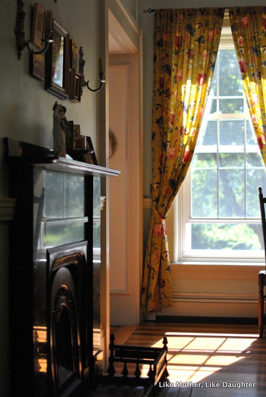
And on this wall below had been an arrangement of some of my favorite of Habou's paintings, but now I'm thinking they could go in the living room and here might be a good spot for family photos, which I have been trying to find a place for that would A) be bright enough for viewing (vs. for instance the hallways which have vast expanses of walls but dim light and no windows) and B) you could get close enough for viewing (vs. for instance above the piano in the living room where there is a vast expanse of wall but the piano — baby grand, you know, wide — would prevent you from getting close).


Just when you think the color is quite green, it goes all robin's-egg:


More babble:
~Bridget did 90% of the work in here. She was my design consultant and she worked super hard to do the prep, which is the burden of the painting of old houses. I'm always all agog when people airily comment that they casually painted a room, just like that. Around here, that does not happen.
Painting is traumatic!
Painting is the least of it!
Thus, she understandably did not quite estimate the time it would take. She underestimated. But as she was determined, despite my warnings, I let her go for it. I knew we'd be in for some chaos but hey. She prepped all week before the camp started, and then painted in the mornings and at night after each session with all those charming but intense children.
~Yes, the floors are striped. To the best of my knowledge, the original floors were all wide pine, and remain so in most of the rooms. An owner around 1917 put this one in — the level is a floor's height above the living room one — probably to cover damage. I don't know why it's striped — maybe he had barely enough of each wood for half a floor? I love it!

Again, BEFORE:

In this post I talk about getting the hutch between the windows, and that was when we moved the black shelf to where this painting is, below:

AFTER:

(My 89-cents-each thrifted vintage tea set may or may not have been my inspiration for the color!)
On Instagram I posted all these test patches, but the first one we tried was this:

It's Olympic “Tranquillity.”
But I knew it would be too dark for a room we'd be in at night.
In the end, we went with me doing my usual, which is rashly mixing, approximately-exactly, to get what I really want, painting that on some random piece of wood, and taking it to Lowe's while still wet (the guy literally dried it with his dryer before scanning it!).
Thus, the paint color is “Tranquillity Plus Two Parts White.”
It's the one on the far right in this IG, painted over the Tranquillity, next to the molding. Looks white, right? This is the label in case you must have exactly this color:

I think you could hand them this pic on your phone to scan, don't you?
The trim is Valspar “Shoreline Haze,” in satin. It is quite close to what was there before, making it possible to escape with only one coat on the exhaustingly high crown molding. Plus, I love it with the blue.

There you have it! What do you think? Isn't Bridget the best?!? And now she's selfishly going back to school, leaving me to not get any painting done on my own. Hmph.

Oh, fabulous! That is the warmest blue imaginable! It looks so great, and is a great complement to the goldens!
Yes to the bulk of the work being the prep. Christy is helping me with a painting project on Thursday and I’m agonizing over which project we might actually be able to do! Every wall needs so much work to get it ready! Touch it, and the problem just goes deeper and deeper!
Woah, My exclamation marks are just working overtime here.
I love to paint but hate the prep work. The benefit of painting a room is the beautiful change that can be had with a gallon (or two) of paint.
Thank the Lord for helpful daughters! (I have four myself)
Love, love , love it! Just beautiful 🙂
Beautiful, Leila! Looks sea-foamy green to me, but lovely whatever one calls it.
As for blue on walls: I should send you a photo of our master bathroom (which we just had redone this past winter): we put a deep sapphire blue on the walls, to contrast with the stone and the brass sconces. I think maybe you’d change your mind.
I love it! Great job, Bridget! It looks very much like the paint I have in my kitchen now – always changing! I had them do ours at 75% strength because our house is so shaded. (If it doesn’t completely shock your sensibilities, I would suggest spray painting the chandelier either a pewter or matte black. I’ve done that a couple times and love how it turns out. It would be beautiful against that color!)
How beautiful! The perfect blue. It shows your art so well, too. I think the chandelier is a good historical layer too, but I second the writer who suggested painting it. Metallic pewter would be timeless and would play off your colors. Bridget is obviously a meticulous worker!
BettieBoyd, the chandelier is nice, and may add a historical layer — but not to my house, which is actually later than the colonial period. So I’m happy I have it (and it was quite free), but I am thinking something else might look better in this room. However, no rush, that’s for sure. Painting it might work too!
On the other hand, the wall color and the curtain fabric and the china cabinet all have more of an 18th- than a 19th-century vibe, so I’d keep the chandelier. I’d also keep its color, because it goes with the gold in the oratory.
Simply lovely!
Simply lovely. Thank you for virtually opening your home to us.
Oh, these sea glass colors are wonderful! I read this in a hurry because I’m at work; but it’s wonderful with the golds! I also feel the coldness of too much blues, but I’m seriously looking at a sea glass-ish counter top, which makes me surprised at myself. These colors are very soothing.
I love that color. That’s actually one of my favorite colors–if I could, I’d paint my entire house that way. Sea glass/robin’s egg/Tiffany blue/mint-ish….those are my favorite colors. (The shirt I’m wearing right now? The color of your walls, pretty much.) I think it’s perfect!
well I love blue and after living in our house for 27 years I finally found the right shade! We have dismal light except in the 2 bedrooms with east facing windows and the kitchen with a west facing window. But most of the activity takes place in the family room with a north facing door that is under a covered patio. Dismal. But Benjamin Moore’s Wyeth Blue was perfect. Like yours, a little turquoise but changes through the day.
On that sideboard where you are thinking of sconces…. Place 2 tall thin matching lamps. It might fill the space better and give you a downward light instead of upward that will cast shadows. Jmho:)
Wanda, yes, I was thinking of some tall things on the sides there. When I move the booze 😉
Of course one issue with an old house — no outlets where you want them! But I could do tall candlesticks.
I have an iron chandelier that holds candlesticks. I have never hung it up (i snagged it free because I loved it) because wouldn’t they drip wax far and wide?
Oh, beautiful, beautiful! Great job, Bridget!! Yes, prepping for painting is exhausting, especially when you’re redoing the trim too, but look at it this way: at least you didn’t have to prime! The walls in our house were a dark brown in most rooms when we bought it, and it took us three coats of primer to get rid of it.
That’s a very beautiful blue, not cold at all, but serene and quiet – like Emily D. writing above me, I’m a little obsessed with it myself: we have something very much like it in the dining room, kitchen, and main bathroom – and a lot of the accessories around the house have that color. I always thought that robin’s egg tea set you have was so delightful, both the shape and the color!
I think the icon wall looks so much better now: it seems to me that the gold of the icons really pops out, as does the chandelier. It will be interesting to see how you will change it.
All in all, a lovely room just got lovelier and even more elegant!
Gorgeous! I love colors that change with the light. And I know all about prep work for painting old houses. It takes way longer than the actually painting! Thanks for sharing; your hard work and perseverance have paid off in a lovely, welcoming room.
Leila,
You have such beautiful windows! Love how tall they are and the new color suites the room well!
I love this room! Thank you for posting pictures. -Julie
I have to say, I’ve always agreed with most of your decorating ideas and tips, but the one thing I could never get on board with was your love for boring white walls. I’m happy you’ve added some color – I love how it looks! And I completely understand about the exhausting prep work before painting in old houses. I enjoy it once I get to the actual painting, but the prep always kills me.
No joke! I am preparing our basement steps for painting. Layers and layers! I am afraid I will just scrape away until tere are no steps left!
Beautiful! But blue and green and grey always are ;).
We have such a new house I think the only way to cozy it up is rich color on the walls- so I have lots! Lol. Our houses couldn’t me more different.
Lovely! I do love the color. So fun that it changes with the light! Every family should have a Bridget.
Yup, your Bridget’s the best! I know a thing or two (from experience) about painting preps, so I’m giving her a standing ovation 🙂
Beautifully done. I love how it changes.
What a lovely room! The paint color is perfect. It sets off all your things so nicely!
oooooh, so glad you chose that blue! From what I see on my monitor, it’s one of my favorite shades of blue. I think it works GREAT with your room and furniture and other colors. All the gold is just lovely – and that’s why I like the chandelier. I think the lines of the chandelier actually look good in there – the graceful curves echo the chairs. I don’t worry about time periods too much (we live in a Victorian house and just nod occasionally to the Victorian era – to wit, marble tile in the foyer with pale pink walls and a very modern, very small ice cube pendant light).
My favorite color? I am paralyzed by homemaking and decorating. We have lived here three years and the walls are white and there are zero pictures and the dark brown 70 s woodwork is dark and water stained.
Beautiful room! My mother always said a room should hug you when you enter. This one definitely does- love the color!
Just lovely! Bridget is the best! I too appreciate white walls but the color you chose sets off your art and curtains beautifully, not to mention your woodwork. I vote yes for a wall of family photos in the dining room where the family gathers to share meals…. It just makes sense. In my parent’s home growing up our mom kept a collection of family photos on a large dining room wall, updating it occationally as we grew. Inevitably guests were drawn to the wall which offered a brief pictorial history of our lives together. Recently, as my seven siblings and I divided up the pictures and prepared to sell our parent’s house, we commented how this dining room wall and the statue of the Blessed Virgin watching over us from the stairwell are icons for us of our childhood home. Our niece and her new husband are buying the house so it seemed right to leave our Blessed Mother right where she is 🙂
Love the blue, it is very warm. Have you thought about spray painting the chandelier?
Oooooh, I love this!! Blue, but not cold. It looks just great with the furniture, and the curtains, too!
GO Bridget!!!
The dining room looks beautiful! Well done! (And for whatever it’s worth/in case of any interest in how the paint color looks on my computer screen, I personally do like blue hues for painting walls (well, light, subtle/pale blues) and don’t tend to be keen on green tones, and I like this color, which looks like a pleasant, subtly grayish, blue color, very much!)
Also, I think Bridget should pass along her recommendations for how we readers might cultivate more of her energetic, enterprising, and perseverant spirit in ourselves, because she accomplished a significant task marvelously well!
I agree with other readers/commenters who suggested thinking about painting the chandelier some sort of pewter tone. I think it would work with the colors of the room (such as they look on my screen, anyway) and might be a “faux” way to blend more with the historic character of the house, at least until you come across a piece that strikes you as exactly what you are looking for!
Thank you for sharing these glimpses of your lovely home and great process with us! 🙂
Oh! And while not the point of your post, the yellow walls of the kitchen visible in the “view from the kitchen” photos you posted are also lovely! I adore pale/pale-ish yellow walls, particularly in rooms that get good sunlight! Did you have to mix paints and create your own blend to get that yellow tone, or did you find a shade that suited the room right out of the paint can?
And best wishes as Bridget prepares to return to school and for a happy, interesting/edifying, and enjoyable start to the school year! 🙂
Leila, about a month ago, I bought pillow cases for my little daughter’s new bedroom in the attic in the exact same shade.. Love.
About the candle sticks on your table – and I also saw them standing on a table cloth in other photo’s. I have similar ones that I have retired to a closet because I always struggle with wax dripping on the table cloth. Such a struggle to get it out!! How do I avoid them dripping on there, or worst case – how do I get it out?!
I’m realising that this is not a laundry post… sorry. But, you know..
Anel, I do know this comment was from YEARS ago, but here are my helpful hints about candle wax.
1) If dripping from melting wax is the problem, you can put a bobeche on top of each candle-holder. This is a glass drip-catcher, which you remove and wash separately. Google it, there are many kinds and some are quite attractive.
2) If splashes of candle-wax from extinguishing the flame are the problem, do one of these things: Never blow out a candle without cupping your hand behind the flame. Or use a candle-snuffer. Either of these things can eliminate the problem.
3) Easy way to get wax out of cloth: Pour boiling water through the tablecloth or other fabric. Repeat until it is gone. If you don’t want dried candle-wax to scrape or scrub from your kitchen sink, do this outdoors.
Best of luck! It took me years of housewifery to figure these out.
LOVE it!!!!
Beautiful!!! What a calm and sustaining color.
I had egg-sactly the same thoughts as a lot of posters about the chandelier–first, goodness, that would be so beautiful in a dark color. Second, oh, but then it would not pick up the gold in the frames. For what it’s worth, I think I landed on painting–simply because there is so very *much* gold in the chandelier–and I think the gold in the icons would glow more without such much gold overhead. And the beautiful lines of the chair backs would be so pretty with dark curves above them.
Pale walls and rich textiles is very much growing on me–thank you for spelling that out so clearly today.
I LOVE that color. Those are the best paints, that look a little different in every light (but always nice). We have a similarly mysterious color in our bedroom. We had them mix it one degree more matte than the normal finish (eggshell? I don’t remember) and in my humble opinion, it looks so much more elegant! Matte walls are the way to go. And I have to say I love decorating with watery blues and greys. But we live somewhere MUCH too warm for our taste, so I will keep your recommendations for color in the back of my mind for when we move up north.
I must ask… Where did you find the fabric for your dining room curtains?! I love the cheeriness of them!!
Thank you, Danielle — I got them from World Market (Cost Plus in some places). They are my absolute favorite and I wish all curtains were along these lines. I’m glad you like them!
I know this post is quite old but I’m wondering about your dining room chairs–I’ve been looking for a new set and just saw some identical to yours on Craigslist. I’m wondering–were the spindle backs ever an issue when your children were young, if you had them then (or now your grandchildren, I suppose)? They look so thin and delicate! Do they need any kind of special treatment? Thank you in advance if you do happen to see this!
The chairs have held up perfectly! It’s been… 30 years? The spindles are strong. You should examine them of course, but mine have held up.